Orlando Health
Organization Rebrand: Framing The Experience
WHAT ARE THE
FOUNDATIONS OF
WELL-BEING?
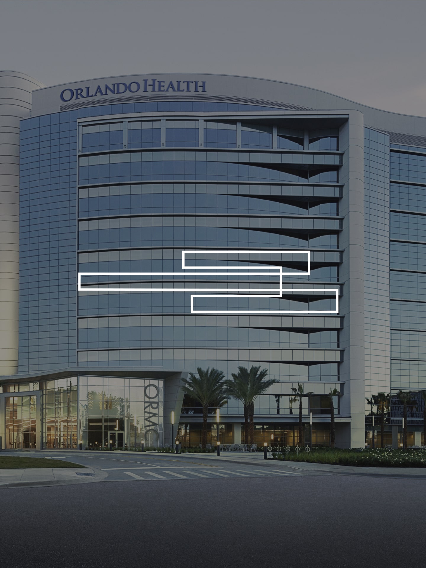
Inspired by the contemporary, architectural totem of the Orlando Health campuses, the pillars of care visual ID aims to frame authentic moments of care and well-being—truly evocative of our mission and imperatives.

Enter the pillars; or as the client evolved the concept: frames.
We started with architecture. Literally. The brand’s facility aesthetics were evolving concurrently, and we borrowed from their contemporary approach.


This visual
framework both
nods to Orlando
Health’s past and
looks forward to
its future.
By laying the foundation for Orlando Health’s differentiation in the market, as well as providing the flexibility to expand, the pillars of care became an effortlessly scalable aesthetic system.
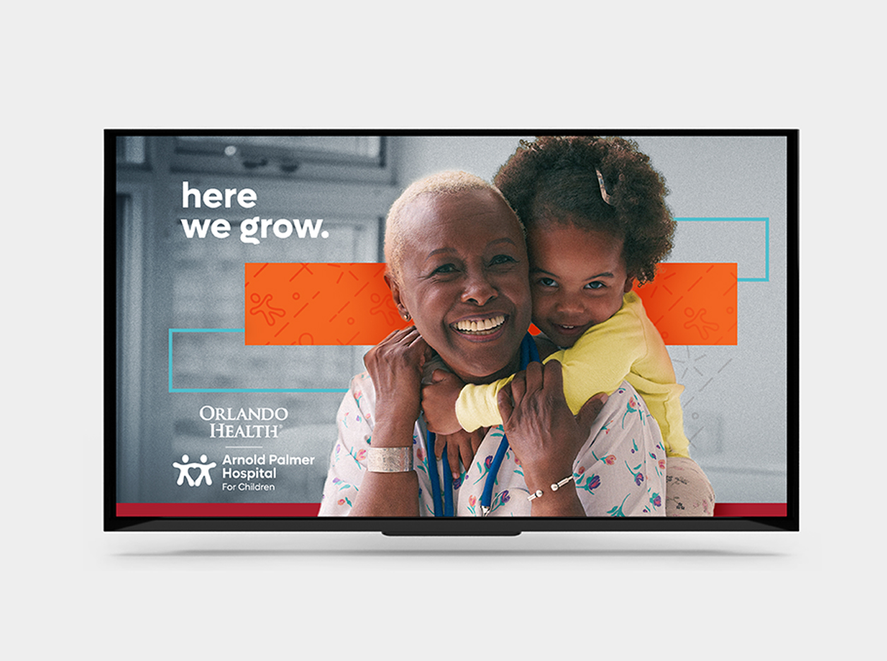

The new visual
identity demanded
closeness and
intimacy.
This required a reimagining of photography selects. With those two tenets in place, plus a new color palette, the visual identity was anchored enough to be both consistent and flexible to scale and adapt.


Scenes of peace of mind, touch, safety and trust are conveyed.

The vibrant orange—associated with encouragement, determination, warmth and sunshine—adds a sense of place to the impactful design with unique touches of modern sophistication.


Case
Studies
Whether it’s branding, omnichannel marketing campaigns, or individual design requests, we create attention-grabbing designs that help you achieve the full potential of your marketing strategy.
Explore projects